

How to Create the Perfect Email Marketing Campaign in HubSpot
Why is growing a small business so difficult? According to the Small Business Administration, about one-third of small businesses fail within the first two years. But why?
1. Why your website leads are so important
You know how significant leads are to your business or company. That’s not something we even need to go into.
They’re your lifeblood, the center for happiness, and more importantly, proof that your marketing works. But how do you make sure that your investments are paying off? How do you make sure that the leads coming through are good ones?
Proving ROI, all these things are just as vital to your success as just getting the website uploaded.
There are a lot of different sales techniques out there, and a lot of things that we could go into forever, but we also realize that you can’t read forever.
That’s why we stick to how your website can produce these leads (while you sleep, work, or whichever).
We’re going to show you how to create content on your website to get people to land on your site, and then how to garner the business development with calls-to-action that work, adding email opt-in forms, and how to build those forms in HubSpot.
And we’ll help you understand the basics of lead generation with your website so that you can build your business in your sleep.
It sounds like a lot of work, and it really is. But when the work you do now helps you beat out your competition later, you’re going to be able to give yourself a pat on the back. Or a raise. Whichever you prefer.
For starters, here are some examples of some really great websites doing just that: using forms and inbound marketing techniques in order to get new leads:
https://blog.thewholebraingroup.com/5-websites-thatll-teach-you-great-lead-generation
2. Structure your website to be user-friendly (UX)
If you’re like most people, you’ve never built out a structure for a website. And that’s alright. It’s a process that we can help walk you through, and you’ll come out feeling like a superhero.
Or, you’ll come out of it generating more leads with your refreshed website. That’s more like it!
Content-first design
A content-first design specifically targets your audience and identifies their issues. One of the most important reasons that they came to the site in the first place was to find out how to fix their issue, and not even necessarily why your product would help them, but why or how they can solve it.
If you’ve positioned your products and developed them correctly, they should be able to find that your business is the solution.
Website copy is one of the most powerful tools in influencing a buyer’s decision and help guide them through the process. It’s the active core in inbound methodology and is the reason why you’re using HubSpot software.
At first, this may seem a little counterintuitive. However, if you follow the content-first method, and always keep value and how your business benefits the customer, you’ll begin to capitalize more on your leads.
For example:

Here’s an advertisement from one of Snowbird’s billboards. If you’re unfamiliar with Snowbird, it’s a ski resort that was obviously a little too advanced for poor Greg.
Here are a few reasons why it’s such great copy. It intrigues you that a company feels that their one star is a benefit, and helps you read on. Before you know it, you realize that the reason they’re boasting about this review is to engage skiers and snowboarders who are looking for this kind of advanced mountain and terrain.
For Snowbird, the riders seeking out that kind of excitement aren’t even going to need a second guess before they book a flight and head down to Utah.
You can find a lot more examples of really great copy through Honeycopy’s site.
To walk you directly through content structure would take us a little far away from our current guide. So, you can download a complete walkthrough for content-first design right here:

Prompt users to take action
Another important aspect of capitalizing on leads with your content is to prompt them to actually take action. This is with simple words like “sign-up” or “click here now.” These buying words can help encourage someone to take action, while also reassuring them that’s the action they need to take in order to get what they want.
For your personal use, here is a list of trigger words that may help your creative process. Just remember, all you need to is to prompt them to take the action you want them to take:
- Download Now
- Click to Purchase
- Sign Up
- Order Now
- RSVP Now
- Get Tickets
Now, this isn’t just done by creating content and then asking them to buy. It’s built throughout the page, issuing mental triggers that help them understand that what your product or service is, will give an answer to the problem that they have.
And they have a way to escape if they realize that it’s not what they want or need. And that’s okay too.
Make sure it makes sense
Navigation is important for one reason: your rankings. Google has developed a way to help rank websites that are easy to navigate using bounce rates, avg. duration on a page, or even broken backlinks.
These metrics are important when helping the user experience. The experience is becoming more important as the average user of a website expects the website to make easy sense, and when they’re using mobile devices (smaller screens) to find the information they’re looking for.
So, it’s your job to make sure that it makes sense.
- Think value and content first
- Less is more
- Make sure all links are active
- Create CTAs that navigate a user wanting to know more
In the analytics chapter, we’ll cover more of what tools you can utilize - all of them are free - in order to track and measure these.
3. Adding a CTA (Call to Action) title
Now that you’ve added content to your site and created some text prompting your users to take action, it’s time to build a call to action button.
These are important because they send your users to a landing page where they can convert.
Implementing a CTA helps your readers gather more information as well, like just understanding a little more about your product or service, and whether it will make the right fit for them.
Implementation
In HubSpot, here’s how you can do it:
Go into your website page editor and click through to a website that you wish to add a call to action to.
Open the editor:
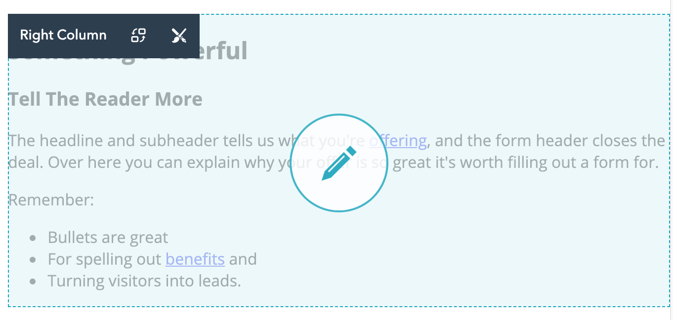
The editor should look similar to the photo.
Click into the edit pencil and a toolbar should open up top.
Next, select a CTA that matches what type of action you’re asking your user to make whether that’s a “Click Here” or “Download.”
When you’re finished, the CTA should upload and show within your page.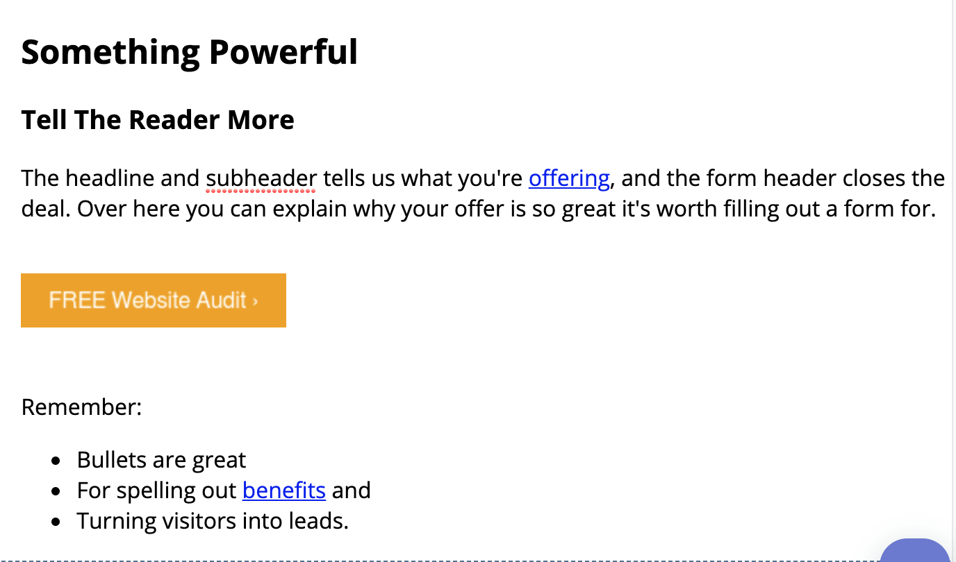
The Call to Action should also be linking to the right page. You can test that in the preview pages to make sure.
We used an example webpage to create this screen share, so our “Settings” page was not filled out yet. If your page is new, you’ll have to go through the settings tab to fill in information like your meta tags and page title, which are extremely important to tell Google what your page is about. If you’d like more information regarding the importance of these tags and descriptions, we’d recommend Neil Patel’s blog for the importance, best practices on how to create them, as well as how to create your own (and most of his blogs have step-by-step guides).
Examples
Examples of really great calls-to-action might be just the thing you need in order to get started, as well as help you understand that these might be one of the easier things you can create.
Conclusion
Okay, so you’ve worked really hard up to this point. The only next step now is to publish. We’d recommend giving the page a preview before you publish. Then go through and publish the page to the web!
4. Build and implement a form
Forms give us an opportunity to capture information above and beyond IPs. We can create buyer personas to start putting new users into different lead capture funnels, and ultimately create more sales.
We also can add forms onto landing pages to get specific information that help us build up the buyer personas within HubSpot, and create profiles that show us information that can be used to target each user better.
It also opens a new way to get that information, whether it’s through a spot strategically placed on your Homepage, a pop-up window that asks someone for their information before they leave your site, and forms can also be used to help a user download additional information and other things of value that you have in your tool chest.
Before I get into more advanced things like implementing an email sign-up window onto your site, get a pop-up set up, or even create a landing page with a form, you need to know how to actually create the form.
Creating the form
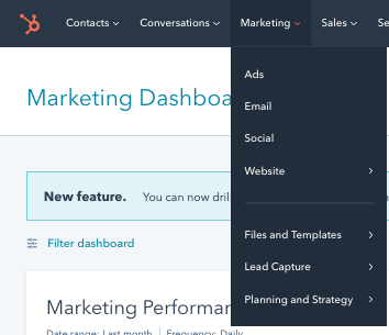
Go into your HubSpot portal and click into the Marketing tab.
Look for “Lead Capture” and go through and click onto “Forms”
The Forms tab should open.
You’re going to click on “Create Form”
HubSpot’s new creation window should populate and look like this:
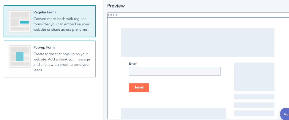
For this situation, we’re going to want to create a regular form.
We’ll go ahead and create a “Newsletter Form.”
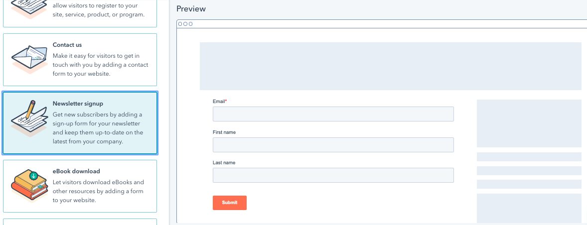
The only difference between any of these pre-populated forms is the information that each is looking for. You can scroll through and find which works best for you. But, in the next window, it won’t really matter much because we’ll drag and drop other information you’d like to gather.
Click “Start” and the next window will bring up options for which information you’d like to gather.
This information will all populate into the user’s profile when they sign up, and can be used to measure different stages in the funnel whether you’re scoring your leads, or just asking for certain information to continue to build their profile over time.
For a newsletter sign-up, we have all the information we currently need: first and last name, and an email. So, we can actually go through and fill out the rest of the information.
You’ll notice that the forms allow for you to customize a follow-up email, a follow-up message after a sign-up, and even which “Submit” buttons to use.
For this example, go ahead and fill those out to what works best for you. We won’t go too much into detail as it’s a little out of scope for this project, as well as the form will already populate right now.
Go ahead and click on “Publish.”
Don’t worry, the form won’t publish anywhere on your site. It just activates the link and embed code that you need for other projects we’re going to go through.
The next window that pops up will carry the embed code. You can go ahead and click copy to get the embed code now, but we’re going to go a step further in case you close this screen or need to post it somewhere else. Or, obviously, accidentally close the screen before getting the embed code.
Congrats on making a form. It’s going to help us in the next Chapter in actually making use of the form and using it to generate new leads for your business.
5. Add email opt-in
Have you ever gone to a website and decided that you liked the product or service they were offering, it most definitely could be beneficial, but you just weren’t ready? That’s where email opt-ins work really well.
They’re a great tool to nurture leads that just weren’t quite ready to purchase. This also goes back to helping your potential leads as much as possible and being as valuable to them as you can before they even make a purchase.
In this day and age, we have to be especially careful to make sure that we’re getting permission to send emails, especially if any of your traffic is coming from Europe. Be sure to check out your country or region’s specific laws.
When we get the email information, we’re able to share upcoming price changes, sales, and especially more blog content that they’ve already come to love.
E-mails are also able to track how engaged a potential buyer is in the information you’re sharing, as well as interest. Getting this information is key to closing more deals.
Adding the opt-in form on your homepage
With email opt-in forms, it’s similar to the process that we followed with our Calls-to-Action. We want to determine where it’s going to fit best - normally within text or bottom of the page - and insert it into the web page.
Some opt-in forms can be created to be shown on the footer of your entire website, but creating these is a little more advanced for this guide.
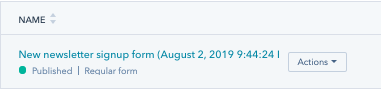
Go to your forms screen again, and hover over your new you’ll find the “Actions” arrow. Click on that.
Click on the actions button and you’ll see a drop down.
Select “Share.”
The screen will populate a box that will have the embed code and a URL link. Go ahead and copy the coding completely. Just clicking on “copy” will do the trick.
Here’s the best part.
Let’s navigate to where you want to make the post: your homepage.
Navigate to your homepage and open up the editor.
Find the edit box and click on it. Find “Insert” on the toolbar.
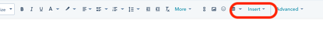
The dropdown will descend and you can go to “embed.”
Paste the code in and click apply.
Congrats. You’ve just implemented your own form into your Homepage.
Add an email pop-up window
What a handy little gadget that pop-up windows can be for websites that are adding a lot of value to their website.
You can have them pop-up as a last resort to someone who would otherwise leave the site, or determine times at which they pop up.
These can help increase your funnel, and give you a chance to at least stay on a user’s mind to take advantage of their interests.
The selections within the form window are going to be almost the exact same. So, navigate to the Forms window as you did earlier in Chapter 5, and create a new form.
Except, in this case, we’re going to choose the “pop-up window selection.”
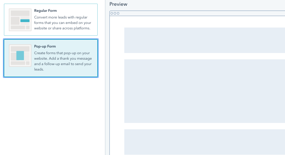
Choose next.
The pop-up box
The pop-up box is great to connect with people that are about to leave your site or are brand new visitors.
If they’re at your website, they’re at least somewhat interested in what you’re doing. They’ve moved past the awareness stage and are now attempting to realize if your company offers an answer to their problem.
The drop-down banner
The drop-down banner is certainly a lot less intrusive. If you tried the pop-up box and are seeing that a lot of people are leaving after the pop-up box has shown, it might be a good idea to give this one a go. The drop-down banner is a little less aggressive and may still get sign-ups from people who are more interested.
The slide-in box left
Both of the sliders are great, except for one main difference. The left box slide-in doesn’t generally have a lot of competition for eyeballs like the right slide-in might. Typically, websites have been using chat boxes, or other small widget pop-ups in the right corner, because more eyeballs go to that side.
If the right slide-in box isn’t working that well, try the left. Maybe having less competition will help your users see it better and prompt them to sign-up
The slide-in box right
Same as the left, except sliding in on the right. As said with the left slider, there tends to be a lot of competition for the right side, considering that someone on your site reading information, their eyes will eventually dart to the right side.
It can be effective, but if there is a ton of competition for that space, the left can be a better option.
Okay, so by now you’ve selected which box is right for you.
Click next and let’s keep going.
Callout
The callout is a simple name for a call to action prompting your user to make a decision on their click. Within the boxes on the callout, you’ll want to use text and and call to action within the callout.
Hint: try utilizing successful calls to action you’ve already tested as a head start. This may help increase your sign-ups right away.
Form
The form is meant to make it easier for someone to sign up rather than send them to a landing page.
Just like our form chapter, the more questions you ask in this space, the less chance of getting a sign up.
Typically, since these pop-ups are aggressive, you should try to just capture an email, possibly a first name.
The best way: test a hypothesis and find out what works best for you
Thank You
Keep the thank you page very simple. Don’t overcomplicate it. Another best practice is to not continue to sell in the thank you page, or prompt someone to take another action. This may start to confuse somebody and make their navigation away from the page.
A simple “Thank you, you’ll be hearing from us soon.” will suffice.
Follow Up
We’ve created a bonus section for any follow-up you have. The follow-up will send emails to the inbox of the user you’ve signed up.
The content we’ve created for that section will help you understand how to create follow-up content and put together emails that will let you nurture your leads. The context of a follow-up email is a little out of the scope for us on a lead generation page, but it will help you close more deals.
Options
For each of the pop-up options, you’ll have a different selection for time and what’s recommended to use, whether it’s a certain percentage of scroll rate or a certain amount of time.
This is another one of those steps where you should ultimately test what works best for your site, but it’s a good idea to use the recommended option here. These are recommended by HubSpot from good practices for that specific type of pop up.
You can also decide to put them into one of your email sequences, decide who notification emails should be sent to, and even turn off the pop-up on small screens (highly recommend this).
Pop-ups generally create a bad experience for small screen sizes, as the user is attempting to look through information and getting pop ups from all angles.
Preview to make sure that everything populates the way that works best for your site.
Publish when you’re finished. Feel free to go back into the forms menu to test multiple pop-ups for success as well as turn the pop-up on or off, depending on what your analytics are telling you.
As with any other implementation into a site, be sure to either have someone on your team or yourself test whether the pop-up works the way it’s supposed to. For the most part, HubSpot has already beta tested all of their products, but that doesn’t mean that there isn’t a glitch from time to time.
6. Testing
At the very beginning of this guide, and all throughout, we talked about monitoring ROI. When it comes to business, this is one of the most important metrics. Without it, we can’t decide whether we should continue with the process, or if the idea hasn’t worked and we need to move on.
In order to prove ROI, not only do you need to use analytics, but you must also first identify how to actually measure the success in an effective way, implement the system, text, and repeat.
As you go through this chapter, we’re going to focus on testing the different lead generation tools that we’ve built together over this small course. To best understand how to use analytics within HubSpot, we’d recommend going into the HubSpot Academy and do some learning. We’d love to share it within this post, but it adds an additional element to your learning.
If you follow-up our guide, the information you produce should let you take HubSpot’s analytics courses and put your data to work.
Let’s test.
Testing
If you didn’t take a picture, it never happened.
This is always the best analogy you go get the big catch fishing, but don’t have a picture to prove it.
The concept is similar when it comes to your marketing: if there are no analytics, it’s like it never happened.
So you shouldn’t start testing in the future. You should start testing your metrics right now.
This is true because if you don’t have your marketing measured, there’s no way for you to compare results, understand whether it was a success or failure - therefore how to improve - or even if you need to go in a different direction.
Fortunately, HubSpot has basically set us up with a bunch of charts and reports which can help you get the metrics you need.
In this chapter, we’ll explore the concept of first-level analytics and testing to make sure that you can measure your results, make improvements, and are comfortable with the results.
A/B Testing
A/B testing is important to continually improve the content that you’re already putting together on your site.
This is how we test one variable versus another, run with some traffic to get results, and implement the results of the better one. Hence, A, B.
HubSpot has A/B testing tools that you can utilize, which will not only track metrics, but you can also help manage traffic to the different tests as well.
The greatest part: you’ll have a catalog of what you’ve tried in the past as well, so you won’t do any backtracking or accidentally test something you’ve tested before.
A/B Testing your calls to action
Up to this point, we’ve led users to take action with your content, had them click through one of your calls to action, and now we need to make sure that we’re maximizing those results.
We do that with multivariate (or A/B) testing.
You’ll want to get to your CTA screen which is under your marketing tab in HubSpot.
You’ll have a list of the CTAs that you created.
Let’s set the stage:
You have a call to action button that’s generating results on the page. Your metrics through HubSpot are telling you that your click-through rate on the page you’ve implemented your call to action is about 1%.
And, only for this scenario, we’ll say that once they’ve clicked through the sign-up is 100%. We’re only using this example because we’re saying that we’re satisfied with our rate of signup once someone clicks through, so we know that we need to improve our click-through rate to make sure we’re getting more sign-ups.
We think that we can do better. The text within the page signal someone to take action by clicking a link, but maybe the text is what’s keeping them from clicking more often.
So let’s test.
Your CTA within your page should be in your call to action list.
Hover over the CTA and click on the drop-down action button.
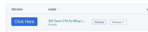
Find multivariate testing, let’s click through that.
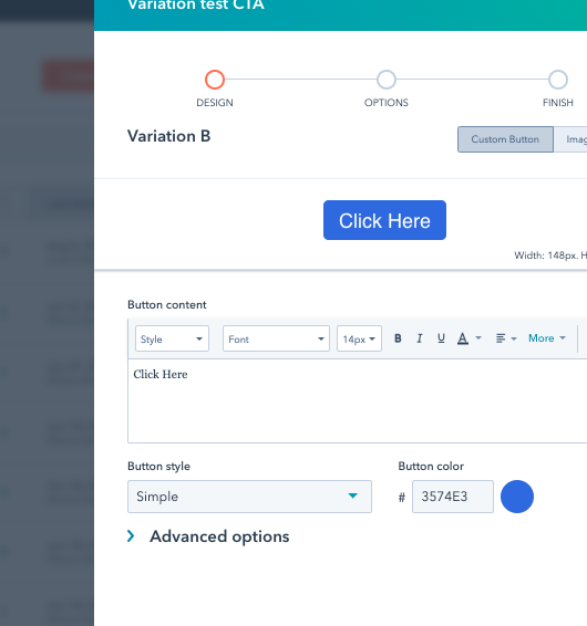
That’s the screen you should have. Please note that there is a name of the CTA “Variation B.”
You can decide in the design window if you want to change the color, upload a pre-made image button, or change the text.
For the simplicity of this exercise, we’re going to just change the text. You can refer to the CTA creation training for more in-depth training.
Click next to continue.
For your internal name, it’s a good idea to try and keep it as simple as possible. I’d use something like: clientname.campaignname.varX. Give the client’s name, name the campaign, and then what variation of the call to action it is. This helps in the long run when you’re sifting through your data to easily recognize which campaign is achieving what.
For all other metrics, the redirect URL, which window is opening, and which campaign is tracking you’ll want to keep these all the same.
Why would we do this? We only want to test for one variable at a time. If you test for more than one variable at a time, you run into a different issue. One of the variables that changed may have improved or reduced your test percentage, but you don’t know which one.
We’re only testing for the text of the call-to-action to see if it gets additional click-throughs.
You can always test other hypotheses in different tests.
Click save and we’re done.
HubSpot will automatically run the test on every page that the call to action is on. If you have pages that are having better results than others, best practices would be to clone a new call-to-action, implement it within the landing page, and use those results instead. You don’t want to mess up the good thing you have on other pages.
A/B Testing your forms
Generally, on a form, you’re going to be testing for something a little different than text: questions.
There are a lot of answers to questions that some users would not be ready to give, so having the right questions within the form can change your results.
And funneling into the questions could be an issue as well.
So, how do we find out? We A/B test our landing pages.
A/B testing the landing page allows for us to use a different variable for a form, or use different text to compare results.
Here we go:
Click through you marketing tab in HubSpot and go to the “Landing pages” tab.
Find the landing page you’d like to test, and like most of our other steps, hover over the entry and click on the “more” dropdown.
Select Create A/B testing variant.
Find the variable you’d like to test, whether it’s the form or the content, and make changes.
Save within the portal and make sure that you’re following good practices:
- Measure one variable at a time
- Keep your campaigns similar
- Name your variant with ClientName.CampaignName.VarX
A/B testing your content
Testing your content starts with stuff the Google can crawl easily such as your headlines and your images.
In order to test these variables, you’re going to have to create a variant, just like you did for the forms.
Go into actions, select multivariant, and voila.
Now, instead of testing forms within the content, go ahead and put in different types of content and test.
Different text can produce different results. You'll want to understand what is most valuable to your audience, as well as what is helping them the most. Reach out to people who have downloaded, reach out to those that haven't. Ask why. The best answers you'll get are from the ones who actually utilize the content.
Conclusion
Testing hypotheses over time will help your page improve the traffic you’re getting, as well as increase the leads you’re serving.
7. Conclusion
That’s our step-by-step guide to getting more leads with your website, and utilizing HubSpot to make sure you’re able to maximize their success.
But now we turn it over to you (or, if you rather have HubSpot Website Experts give you hand, we're here to help.
What did you think about this guide? Whom do you know that this would be valuable to? Be sure to share it with them as well.
Was there something that we missed?
Let us know by leaving a comment. Or feel free to reach out to us if you’d like to know a little more about one of the topics.
Nice work!

Pulling analytical data from the HubSpot platform is Austin's favorite pastime! He loves to see which pages are performing the worst and the best and continues to massage the elements for continual site improvements.