

Learn How to Leverage HubSpot's SEO Tool and Google PageSpeed Insights
I had a mentor a few years ago who said something that really stuck with me. He said, "all money flows through forms". This was so simple and so obvious that I didn't understand the implications at first. Instead of looking at forms as static elements on par with other page elements, this statement implies that forms are THE most important element. Of course, the content goes hand in hand with forms - if you don't have the content people want they won't be using your forms - but the ideal user flow culminates in some sort of form submission. Below, I outline three design concepts to elevate your form design and improve form submission rates.
It's supposed to be easy for users to fill out forms and click 'submit'. This is basically the whole reason your website exists in the first place - to make sales or collect info that can lead to sales - and this all happens through forms. The most basic form has one field - usually for emails - and a 'submit' button. The main focus here is design, design, design. Here's 3 design tips for making the most of your forms.
1. Large input fields
This is trending - and for good reason. Large input fields make it easier for users to interact with the form. And in the age of mobile dominance, bigger form fields make the most sense on smaller screens.
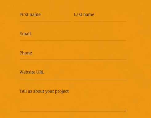
Here's a good example. This is our contact form we use in our footer. Nice, big input fields create a better experience for desktop and mobile users.
2. Large buttons
This is another design choice in response to mobile browsing popularity. We NEED big buttons in the mobile world. These are easy to achieve by adjusting the padding and font size.This is another example from our website. The big button naturally draws in attention. There's a reason we call these 'Call-to-action' buttons. That's what they do! They grab our attention and, hopefully, call us to click that button! While this example isn't tied to a form, it's a good example of button design for forms.
3. Field labels
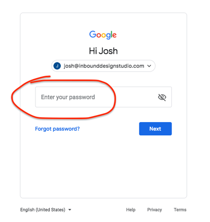
A popular approach to form labels is to use 'placeholder' text.

This is a good approach but as soon as the user starts typing in the input field, the label disappears. This may not be a big deal for simple forms with limited input fields but if you have more elaborate forms it can be confusing to users when the label disappears.

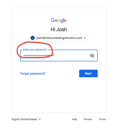
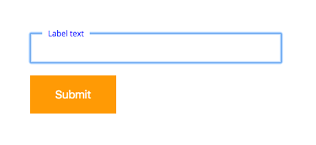
There's an extra design step here that is crucial for UX and can set you apart from other websites. After all, Google currently does this with their forms so you know it's been tested and ruled effective. When a user clicks into the input field and makes it 'active', the form 'label' moves to just above the input.
Here's a code example to replicate the above:
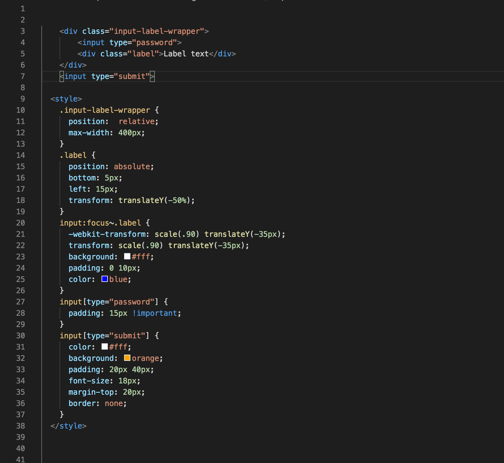
This will produce something similar to this:
Conclusion
Remember, it's all about the forms. Everything flows through your forms. But don't stop at design. Once you've implemented these concepts into your forms and you've collected a nice email list of leads, learn how to cultivate those leads by designing and building an automatic email template to connect with those potential clients.
We're here to help. If you need expert HubSpot design, development or support please reach out today!

Josh is the owner of Inbound Design Partners and a HubSpot & WordPress expert. With years of experience solving complex web challenges, he helps businesses build smarter, more effective websites. Have a question about making your website work better? Josh has the answers.

